
Media Kit

Go-to resources to use when referencing Nscale and its affiliates in any media and public-facing communications.

Logo Placement

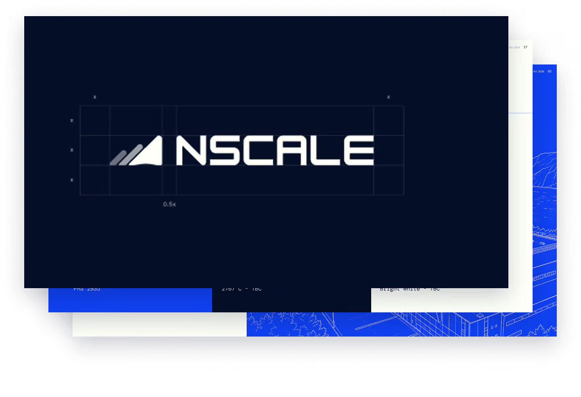
Maintain a clear space around the logo to preserve its visibility and integrity. This should be at least 0.5x height on all sides. The logo should never be placed too close to the edge of a page, image, or other graphical elements.

Wordmark & icon

Priority should be given to using the logo in its complete form. However, if this is not possible the Wordmark and Icon can be used separately, with the same principles for placement.

Color Palette

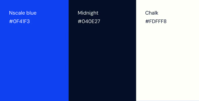
The Nscale color palette frames Nscale's blue (#0F41F3) with a range of deep, near-black neutrals. The blue is the signal, used sparingly for emphasis, key actions, and moments that matter.

Typography

Nscale uses DM Sans for headline and body text, providing a clean, minimalistic aesthetic. Display and Numerical elements are differentiated in DM Mono.

Brand Guidelines

For more detail on the usage of the Nscale logo, colour, typography and graphics, check out our brand guidelines or reach out to marketing@nscale.com